Branding
The Serloading identity.
Every growth story starts with a loading screen. Our logo comes from that idea: a curling S with a progress bar underneath.
Logo
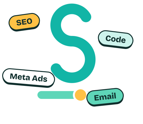
Our main logo: a soft, round S, a progress bar moving below it and tags around it showing our fields (SEO, Code, Meta Ads, Email). The name and the visual say the same thing: work is always loading, always growing. In small spaces like the header and favicon only the S and the “serloading” wordmark are used.
- 01The SA single-weight stroke with round ends. Friendly but clear.
- 02Progress barThe filled part shows progress, the light part shows potential.
- 03Yellow knobA slider knob. On this site it actually moves as you scroll.
- 04TagsChips showing our service fields. Every field we work in is part of the logo.
Colors
Two main colors and a neutral. Mint brings trust and freshness, yellow adds energy. Instead of dark backgrounds we use light, airy surfaces.
- Mint
#12B5A6Primary, accents - Deep mint
#0A786EText and links (contrast) - Pale mint
#CDF3ECSurfaces, bar track - Sun
#FFC145Action buttons, knob - Ink
#0F2E2CMain text - Ground
#F3FBF8Page background
Typography
A characterful, soft grotesque for headlines and a readable sans for body text. Both are self-hosted, no external requests.
Bricolage Grotesque
Growth is loading.
Figtree
ABCÇDEFGĞHIİJKLMNOÖPRSŞTUÜVYZ abcçdefgğhıijklmnoöprsştuüvyz 0123456789
How did we build this site?
The site is built as a measurable product, not just a showcase. What we paid attention to:
Speed
Static generation (Astro), zero external font requests, only the JavaScript that is needed. Target: LCP < 2.5 s, CLS ≈ 0.
SEO
Clean URLs, separate paths for TR/EN (/ and /en/), hreflang, canonicals, sitemap and structured data (Organization, Person, FAQ).
GEO & AEO
Clear, quotable answer blocks, FAQ schema, llms.txt and a robots.txt that is open to AI crawlers.
Accessibility
Full keyboard navigation, visible focus ring, WCAG AA contrast, semantic HTML and a skip link.
Motion
Motion is storytelling, not decoration. Designed by the rules below.
Honesty
No made-up numbers, fake references or fake trust badges. Only what is real gets written.
Our motion rules
The page is told with a loading bar: as you scroll the bar fills, and every section moves it one step forward.
- Not everything moves. Only elements that carry meaning.
- Three different speeds and curves, no one-size-fits-all transition.
- Only transform and opacity are animated (60 fps).
- If "reduce motion" is on, all animation switches off and the content simply appears.
Usage
Do
- Use the logo on a light, calm background.
- Leave clear space of at least half the S height around it.
- At small sizes, use the S symbol alone.
Don’t
- Don’t stretch or rotate the logo.
- Don’t change the colors.
- Don’t place it over busy photos.
Let’s take it to 100%.
Write your goal in a few lines and we will reply within 1 business day.